
YouTube Thumbnail Design Set
Education / Content Creator
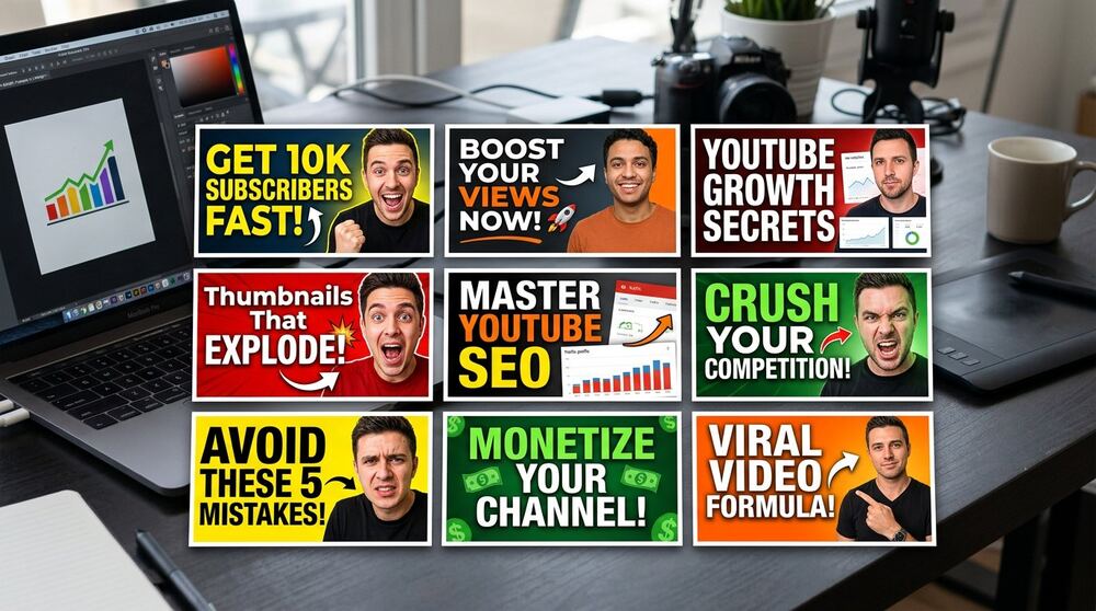
What this project set out to do
Project type: YouTube thumbnail design. Objective: design a set of thumbnails that stay readable at mobile sizes, communicate each video's promise instantly and stay consistent as a recognizable series. Services involved: thumbnail concept, typography and contrast design. Business purpose: lift click-through rates so great videos actually get watched.
Responsibilities & tools
Concept, typography, color/contrast design, series consistency system.
Deliverables in detail
- Readability-first typography (legible at mobile size)
- Contrast and focal-point planning per thumbnail
- Consistent series styling for channel recognition
- A/B variant layouts for testing concepts
- Export presets for YouTube specifications
Honest status of this work
A YouTube thumbnail design set built for click-through rate — readable at mobile size, consistent across the series and delivered with export presets.
How the work was evaluated
The visual work needed to communicate at the size and context where people would actually see it. Hierarchy, readability, brand consistency and platform-ready export mattered alongside appearance.
The project brief identifies the work as Client Project, in the Education / Content Creator context, with a stated timeline of 1 week. Those labels are preserved exactly. This review expands the reasoning around the documented scope; it does not add a client name, confidential detail, ranking, revenue figure, conversion rate or other result that is absent from the source record.
From brief to an executable scope
The focus was YouTube thumbnail design — high-CTR, series-consistent thumbnail set. A useful scope translates that focus into assets and checks that another person can review. It also separates delivery from business outcomes. Delivery can be verified through files, settings, pages, research fields or campaign structure. Business impact requires observation after implementation and can be influenced by the offer, market, budget, competition and client follow-up.
Before execution, the practical questions are straightforward: What must be delivered? Which access or source material is required? Who approves it? What would make the item complete? What remains outside scope? Answering these questions reduces revision loops and protects both the client and freelancer from vague expectations.
Deliverable-by-deliverable quality notes
- Readability-first typography (legible at mobile size). This item was reviewed as part of the stated project scope. Its completion check focused on whether the deliverable supported the project goal and could be understood or used by the client after handover, rather than adding an unsupported performance claim.
- Contrast and focal-point planning per thumbnail. This item was reviewed as part of the stated project scope. Its completion check focused on whether the deliverable supported the project goal and could be understood or used by the client after handover, rather than adding an unsupported performance claim.
- Consistent series styling for channel recognition. This item was reviewed as part of the stated project scope. Its completion check focused on whether the deliverable supported the project goal and could be understood or used by the client after handover, rather than adding an unsupported performance claim.
- A/B variant layouts for testing concepts. This item was reviewed as part of the stated project scope. Its completion check focused on whether the deliverable supported the project goal and could be understood or used by the client after handover, rather than adding an unsupported performance claim.
- Export presets for YouTube specifications. This item was reviewed as part of the stated project scope. Its completion check focused on whether the deliverable supported the project goal and could be understood or used by the client after handover, rather than adding an unsupported performance claim.
Technical and practical checks
- Check 1: Review the design at actual mobile or feed size instead of only on a large artboard.
- Check 2: Check contrast, focal point, text hierarchy and safe areas for the intended platform.
- Check 3: Keep editable source organization and export naming understandable for future use.
- Check 4: Judge creative variants by the communication problem they test, not by decoration alone.
Quality assurance should follow the real delivery environment. That may mean reviewing mobile pages, validating a spreadsheet sample, checking search terms in an account, or opening exported creative at platform size. A tool report is supporting evidence; it is not a replacement for using the deliverable as the intended person would.
Measurement without invented results
The documented outcome for this project is: A YouTube thumbnail design set built for click-through rate — readable at mobile size, consistent across the series and delivered with export presets. This wording describes what was delivered. Where the source does not include post-delivery numbers, this case study does not manufacture them. A responsible next phase would establish a baseline, define the relevant business action and observe a suitable period before drawing conclusions.
Useful measurement depends on the project category. Website work may track form health, speed and qualified enquiries; SEO work may review indexation, relevant query visibility and organic actions; advertising may connect platform conversions to accepted leads; research may track verification and sales acceptance; design may assess readability, consistency and response in context. These are measurement options, not claimed results for this project.
What this case study can help a prospective client decide
A prospective client can use the scope to compare needs, not to assume an identical project. The most useful information to share before requesting a quote is the business goal, audience, current assets or accounts, required deliverables, target market, deadline and known constraints. That makes it possible to recommend a focused starting point and identify dependencies before a price is confirmed.
Project questions
Can the same approach be used in another industry?
The planning principles can transfer, but the research, language, audience and acceptance criteria must be adapted. Reusing a process is sensible; copying assumptions, creative or keywords without market evidence is not.
Does this case study guarantee the same outcome?
No. It documents the existing project scope and delivered status. Search, advertising, sales and website outcomes depend on factors beyond a single deliverable. Any new project should begin with its own baseline and written scope.
What should be provided for a similar quotation?
Share the goal, relevant URL or account context, audience and location, available content or data, deadline and preferred communication route. Use the contact page to discuss the scope, or compare the documented starting points on the pricing page.