
High-Converting Landing Page Design
Digital Marketing / Lead Capture
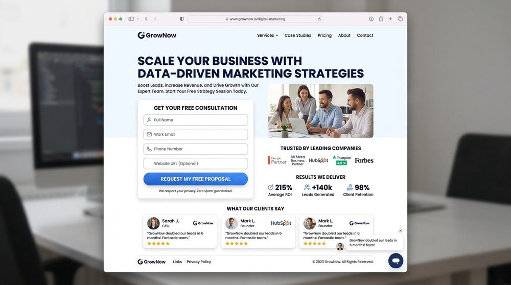
What this project set out to do
Project type: landing page development for paid traffic. Objective: design and build a single-purpose page for a Google or Meta Ads campaign — message-matched hero, proof section, objection-handling FAQ and a friction-minimal lead form. Services involved: conversion structure planning, custom HTML/CSS/JS build and speed optimization. Business purpose: convert expensive ad clicks into qualified leads instead of bounces.
Responsibilities & tools
Conversion structure planning, copy hierarchy, custom HTML/CSS/JS build, form UX, speed optimization.
Deliverables in detail
- Above-the-fold headline/subheadline with a single clear CTA
- Problem → solution → proof → objection → CTA section flow
- Lead capture form with minimal fields and inline validation
- WhatsApp alternative contact route
- Social proof and testimonial structure
- Compressed assets — entire page under lightweight budget
- Mobile-first layout tested at 360px, 390px, 768px and up
Honest status of this work
A high-converting landing page built for a campaign and lead-generation client — a single-goal conversion structure that adapts to any offer, industry or country.
How the work was evaluated
The website had to connect business communication with a technically dependable front end. Page purpose, mobile behavior, loading cost, accessibility and search structure therefore belonged in the same review rather than in separate handoffs.
The project brief identifies the work as Client Project, in the Digital Marketing / Lead Capture context, with a stated timeline of 2 weeks. Those labels are preserved exactly. This review expands the reasoning around the documented scope; it does not add a client name, confidential detail, ranking, revenue figure, conversion rate or other result that is absent from the source record.
From brief to an executable scope
The focus was Custom landing page development — single-goal page built for ad campaigns. A useful scope translates that focus into assets and checks that another person can review. It also separates delivery from business outcomes. Delivery can be verified through files, settings, pages, research fields or campaign structure. Business impact requires observation after implementation and can be influenced by the offer, market, budget, competition and client follow-up.
Before execution, the practical questions are straightforward: What must be delivered? Which access or source material is required? Who approves it? What would make the item complete? What remains outside scope? Answering these questions reduces revision loops and protects both the client and freelancer from vague expectations.
Deliverable-by-deliverable quality notes
- Above-the-fold headline/subheadline with a single clear CTA. This item was reviewed as part of the stated project scope. Its completion check focused on whether the deliverable supported the project goal and could be understood or used by the client after handover, rather than adding an unsupported performance claim.
- Problem → solution → proof → objection → CTA section flow. This item was reviewed as part of the stated project scope. Its completion check focused on whether the deliverable supported the project goal and could be understood or used by the client after handover, rather than adding an unsupported performance claim.
- Lead capture form with minimal fields and inline validation. This item was reviewed as part of the stated project scope. Its completion check focused on whether the deliverable supported the project goal and could be understood or used by the client after handover, rather than adding an unsupported performance claim.
- WhatsApp alternative contact route. This item was reviewed as part of the stated project scope. Its completion check focused on whether the deliverable supported the project goal and could be understood or used by the client after handover, rather than adding an unsupported performance claim.
- Social proof and testimonial structure. This item was reviewed as part of the stated project scope. Its completion check focused on whether the deliverable supported the project goal and could be understood or used by the client after handover, rather than adding an unsupported performance claim.
- Compressed assets — entire page under lightweight budget. This item was reviewed as part of the stated project scope. Its completion check focused on whether the deliverable supported the project goal and could be understood or used by the client after handover, rather than adding an unsupported performance claim.
- Mobile-first layout tested at 360px, 390px, 768px and up. This item was reviewed as part of the stated project scope. Its completion check focused on whether the deliverable supported the project goal and could be understood or used by the client after handover, rather than adding an unsupported performance claim.
Technical and practical checks
- Check 1: Read every page at phone width and confirm that navigation, headings and the main action remain understandable.
- Check 2: Check semantic headings, metadata, image dimensions, alternative text, sitemap entries and form behavior before launch.
- Check 3: Test the useful path from landing page to enquiry with a keyboard, touch input and a slow mobile connection.
- Check 4: Keep JavaScript proportional to the interaction so essential information is available without unnecessary processing.
Quality assurance should follow the real delivery environment. That may mean reviewing mobile pages, validating a spreadsheet sample, checking search terms in an account, or opening exported creative at platform size. A tool report is supporting evidence; it is not a replacement for using the deliverable as the intended person would.
Measurement without invented results
The documented outcome for this project is: A high-converting landing page built for a campaign and lead-generation client — a single-goal conversion structure that adapts to any offer, industry or country. This wording describes what was delivered. Where the source does not include post-delivery numbers, this case study does not manufacture them. A responsible next phase would establish a baseline, define the relevant business action and observe a suitable period before drawing conclusions.
Useful measurement depends on the project category. Website work may track form health, speed and qualified enquiries; SEO work may review indexation, relevant query visibility and organic actions; advertising may connect platform conversions to accepted leads; research may track verification and sales acceptance; design may assess readability, consistency and response in context. These are measurement options, not claimed results for this project.
What this case study can help a prospective client decide
A prospective client can use the scope to compare needs, not to assume an identical project. The most useful information to share before requesting a quote is the business goal, audience, current assets or accounts, required deliverables, target market, deadline and known constraints. That makes it possible to recommend a focused starting point and identify dependencies before a price is confirmed.
Project questions
Can the same approach be used in another industry?
The planning principles can transfer, but the research, language, audience and acceptance criteria must be adapted. Reusing a process is sensible; copying assumptions, creative or keywords without market evidence is not.
Does this case study guarantee the same outcome?
No. It documents the existing project scope and delivered status. Search, advertising, sales and website outcomes depend on factors beyond a single deliverable. Any new project should begin with its own baseline and written scope.
What should be provided for a similar quotation?
Share the goal, relevant URL or account context, audience and location, available content or data, deadline and preferred communication route. Use the contact page to discuss the scope, or compare the documented starting points on the pricing page.